A Couture Guide to Wedding Place Cards & Seating Etiquette
In the world of high-end wedding planning, there is a distinct difference between an event that is merely "pretty" and one that is truly curated. At Felicitations, we view the wedding place card as the ultimate architectural detail of the reception. It is a guest’s first personal interaction with your celebration—a tactile greeting that signals they have a dedicated, meticulously planned space at your table.
While many view place cards as a simple organisational tool, the modern, style-conscious couple understands they are a critical editorial detail that bridges the gap between functional signage and fine art. In this comprehensive guide, we explore the nuances of designing, styling, and executing the perfect seating arrangement for the discerning host.
1. The Identity of the Table: Why Place Cards Matter
A place card is much more than a name on a piece of paper. It is the visual anchor of the plate and the signature of a well-styled table.
The Psychological Impact
When a guest finds their seat and sees their name beautifully typeset on premium cardstock, it creates an immediate sense of belonging. It tells them that their presence was not only expected but thoughtfully integrated into the aesthetic of the day. This is "Personalised Prestige"—a hallmark of the Felicitations experience.
Practical Perfection
Beyond the emotional impact, place cards offer essential practicality for formal, sit-down weddings. They ensure a smooth, organised flow, preventing the confusion that often accompanies unassigned seating at large-scale events.
2. Quantity and Service: Crafting the Guest Experience
At Felicitations, we follow the gold standard of luxury hospitality: one card per guest.
Why Individual Cards?
Unlike casual events where couples might be grouped together, a high-end wedding demands individual recognition. This approach maintains absolute clarity for both your guests and the venue staff, particularly when managing complex dietary requirements or alternate-drop meal services.
The Synergy of Seating
Place cards work in harmony with your seating chart. While the seating chart guides guests to the correct table, the place card provides the final "handshake," leading them to their exact silhouette at the tablescape.
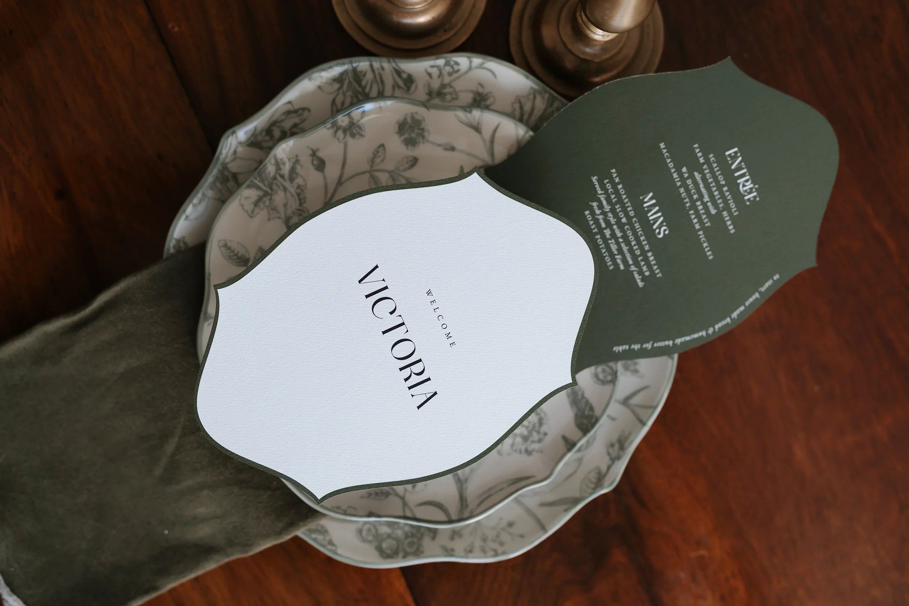
3. The Anatomy of an Editorial Place Card
While the function is simple, the execution at Felicitations is complex. We focus on optical spacing and typographic balance to ensure every card is a work of art.
Wording & Etiquette
-
First Names: The most common and intimate choice, perfect for weddings where guests are primarily close friends and family.
-
Full Names: Adds a polished, formal layer of prestige. This is highly recommended for grand ballrooms or corporate-style galas to avoid confusion between guests with the same first name.
-
Table Numbers & Icons: Some couples choose to include table numbers or small icons to denote meal choices for the waitstaff, a practical detail we can incorporate with editorial grace.
4. Selecting Your Silhouette: Flat vs. Folded
The shape of your place card should be dictated by your overall table proportions and linen choices.
The Flat Petite (100 x 50mm)
Minimalist and modern. These cards are designed to rest gracefully on a folded napkin or be tucked into the top of a menu. They offer a sleek, "name-on-plate" aesthetic that is currently dominating editorial wedding trends.
The Classic Tent (Folded 100 x 50mm)
Timeless and dimensional. Folded cards stand independently, adding an architectural element to the table. They are ideal for settings with textured linens where a flat card might get lost in the drape.
The Sculptural Flat (90 x 90mm)
A bold, square silhouette for the modern minimalist. This shape provides more "white space" around the name, allowing the typography to breathe and creating a high-fashion, gallery-style look.
5. Textures of Luxury: 350GSM Cardstock vs. Acrylic
Materiality is the foundation of the Felicitations brand DNA. We believe stationery should be felt as much as seen.
Premium Cardstock
We utilise premium European cardstocks ranging from 300gsm to 350gsm. These heavyweight papers provide a sturdy, high-end feel that resists curling and exudes understated elegance.
Architectural Acrylic
For couples seeking a "statement" piece, our high-shine acrylic place cards are the ultimate choice. These can be laser-etched or printed with high-resolution white ink, doubling as a luxury keepsake that guests often take home.
6. The Signature Finish: White Ink and Metallic Foil
To move your stationery into "heirloom quality," we offer couture print finishes.
-
Digital Foil: Genuine metallic foil that catches the romantic evening light of your reception.
-
White Ink: A striking, modern choice that pops beautifully against saturated paper colors like forest green, deep navy, or charcoal.
-
Bespoke Die-Cutting: From rounded "Arches" to custom sculptural shapes, we can precision-cut your cards to match your event's architectural theme.
7. Logistics: The Seamless Path to Your Table
Managing guest lists can be one of the most stressful parts of wedding planning. At Felicitations, we have refined the process to be effortless.
The Timeline
We recommend finalizing your place card design at least 4 weeks before your wedding day. This ensures ample time for our two included rounds of digital revisions and meticulous hand-finishing in our Perth studio.
The Submission
Once your order is placed, we provide a structured template for your names. We simply require your final list 48 hours before we begin the printing process, allowing you to accommodate those last-minute RSVP changes with ease.
8. Styling Tips: Coordinating Your Full Suite
For a truly sophisticated look, your place cards should not exist in a vacuum; they must be a continuation of your wedding's visual narrative.
Cohesive Continuity
We match your typography, color palette, and cardstock finishes to your invitations, menus, and seating charts. This creates a seamless visual thread that tells a story from the first Save the Date to the final seat at the table.
Placement
-
Above the Plate: The classic, formal position.
-
Beside the Plate: Works well for casual, family-style, or banquet dining.
-
On the Napkin: A decorative touch that integrates the stationery with your linen choice.
9. Conclusion: The Felicitations Difference
At Felicitations, we are dedicated to helping you achieve a "Dior" standard of excellence. Based in Perth and delivering nationwide, we blend traditional craftsmanship with modern innovation to ensure your table is nothing short of flawless.
Your wedding place card is a small detail with a monumental impact. It is the final, perfect layer of your reception styling—a gesture of luxury that your guests will notice and remember.
Explore the Place Card Collection
Explore Felicitations Wedding Stationery
If you are planning your perfect day, you may also love:
Share:
The Definitive Guide to Luxury Wedding Menus